参考:
罗大富
CSS 参考手册 | 菜鸟教程
W3school
1. CSS
CSS全名是层叠样式表,中文名层叠样式表。用于定义网页样式和布局的样式表语言。
通过 CSS,你可以指定页面中各个元素的颜色、字体、大小、间距、边框、背景等样式,从而实现更精确的页面
设计。
CSS通常由选择器、属性和属性值组成,多个规则可以组合在一起,以便同时应用多个样式
1
2
3
4
| 选择器{
属性1: 属性值1;
属性2: 属性值2;
}
|
- 选择器的声明中可以写无数条属性
- 声明的每一行属性,都需要以英文分号结尾
- 声明中的所有属性和值都是以键值对这种形式出现的
选择器就是选择要应用样式的HTML元素或者标签,它可以选择所有元素或特定元素或特定类或特定id。
示例:
1
2
3
4
5
|
p{
color: bulue;
font-size: 16px;
}
|
1.1 CSS导入方式
下面是三种常见的 CSS 导入方式:
- 内联样式(Inline styles):直接将样式放在标签中,标签有
style属性,可以直接定义style格式
- 内部样式表(Internal Stylesheet):放在html标签头部
- 外部样式表(External Stylesheet):单独放在CSS文件中,允许多个网页使用同一个样式
三种导入方式的优先级:内联样式>内部样式表>外部样式表
1.1.1 内部样式表
内部样式表就是将CSS样式放在HTML文档的头部,head标签中
1
2
3
4
5
6
7
8
9
10
11
12
13
14
15
16
17
18
| <!DOCTYPE html>
<html lang="en">
<head>
<meta charset="UTF-8">
<meta name="viewport" content="width=device-width, initial-scale=1.0">
<title>CSS导入方式</title>
<style>
p{
color: blue;
font-size: 16px;
}
</style>
</head>
<body>
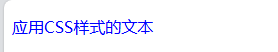
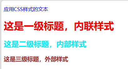
<p>应用CSS样式的文本</p>
</body>
</html>
|
对于所有的p标签,它的字体颜色均为蓝色,大小均为16px

1.1.2 内联样式
1
| <h1 style="color: red">这是一级标题,内联样式</h1>
|
1.1.3 外部样式
须在头部添加link标签,href属性中是外部样式文件的路径地址:
1
| <link rel="stylesheet" href="./style.css">
|
其中,style.css文件内容如下:
综合测试:
1
2
3
4
5
6
7
8
9
10
11
12
13
14
15
16
17
18
19
20
21
22
23
24
25
26
| <!DOCTYPE html>
<html lang="en">
<head>
<meta charset="UTF-8">
<meta name="viewport" content="width=device-width, initial-scale=1.0">
<title>CSS导入方式</title>
<link rel="stylesheet" href="./style.css">
<style>
p{
color: blue;
font-size: 16px;
}
h2{
color: rgb(0, 238, 255);
}
</style>
</head>
<body>
<p>应用CSS样式的文本</p>
<h1 style="color: red">这是一级标题,内联样式</h1>
<h2>这是二级标题,内部样式</h2>
<h3>这是三级标题,外部样式</h3>
</body>
</html>
|
1.2 选择器
选择器是 CSS中 的关键部分,它允许你针对特定元素或一组元素定义样式
- 元素选择器
- 类选择器
- ID 选择器
- 通用选择器
- 子元素选择器
- (包含选择器)后代选择器
- 并集选择器(兄弟选择器)
- 伪类选择器
我们上面对标签格式修改使用的是元素选择器。
1.2.1 类选择器
我们可以在style标签对中使用元素选择器对标签对进行格式修改,使用.
1
2
3
4
5
6
7
8
9
| <style>
h2{
color:aqua;
}
h3{
background-color: yellowgreen;
}
</style>
|
但如果我们只想将h3标签对中class属性值为highlight的标签才修改,而其他的不修改,应该怎么做:
我们只需将h3改为.highlight,就能将对应clss属性值相同的标签修改为相同的格式:
1
2
3
4
5
6
7
8
9
| <style>
.highlight{
background-color: yellowgreen;
}
</style>
<h3 class="highlight">类选择器示例</h3>
<h3">另一个类选择器示例</h3>
|
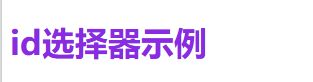
1.2.2 id选择器
我们也可以根据使用id选择器,对特定id的标签格式进行修改,使用#
1
2
3
4
5
6
7
8
| <style>
#header{
color: blueviolet;
font-size: 33px;
}
</style>
<h4 id="header">id选择器示例</h4>
|
1.2.3 通用选择器
通用选择器就是选择所有元素,使用*
1
2
3
| *{
font-family: 'KaiTi';
}
|
这里将所有元素的字体设为楷体。
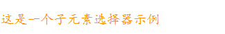
1.2.4 子元素选择器
选择位于父元素内部的子元素,就是一个大标签嵌套一个小标签,子元素选择器用于选择小标签。
1
2
3
| <div class="father">
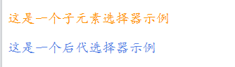
<p class="son">这是一个子元素选择器示例</p>
</div>
|
比如,div就是一个大标签,嵌套一个子标签p,子元素选择器是通过大标签和子标签的类名来定义的:
1
2
3
4
| /*子元素选择器*/
.father > .son{
color:rgb(255, 145, 0)
}
|
这里,更换类名为father的父标签下类名为son的子标签的颜色
1.2.5 后代选择器
如果子标签还嵌套一个更小的子标签呢?比如:
1
2
3
4
5
6
| <div class="father">
<p class="son">这是一个子元素选择器示例</p>
<div>
<p class="grandson">这是一个后代选择器示例</p>
</div>
</div>
|
那么子元素选择器对类名为grandson的嵌套子标签就没作用了,因为它不是father的直系子标签。
这时,必须使用后代选择器:
1
2
3
4
5
| /*后代选择器*/
.father p{
color:rgb(81, 126, 229);
font-size: larger;
}
|
该选择器会将类名为father下的所有子标签p的颜色都变为设定颜色。
第二行字体的颜色确实变了,但是第一行为什么不变,第一行也是类名为father下的子标签呀。
其实这涉及到优先级的问题,id>类>标签名,因为子元素选择器相当于类选择器(通过.类名构造),所以肯定比p标签选择器优先大,所以第一行不改变。
1.2.6 兄弟选择器
1
2
3
4
5
6
7
8
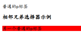
| /*相邻兄弟选择器*/
h3 + p{
background-color: red;
}
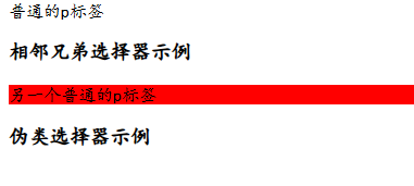
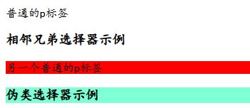
<p>普通的p标签</p>
<h3>相邻兄弟选择器示例</h3>
<p>另一个普通的p标签</p>
|
该选择器会将紧跟在h3后面第一个的p标签格式进行修改:
1.2.7 伪类选择器
用于选择HTML文档的元素的特定状态或位置,不仅仅是元素的属性。它以冒号开头,用于构造用户交互结构,比如,鼠标悬停在一个元素上,元素的格式或者状态可以被改变,这种方式可以通过伪类选择器实现。
1
2
3
4
5
6
| /*伪类选择器*/
#element:hover{
background-color: aquamarine;
}
<h3 id="element">伪类选择器示例</h3>
|
一开始伪类选择器文本无背景颜色,当鼠标放在上面之后,会有背景颜色生成:
也可以通过伪类选择器,选择父元素中的第一个元素,
1
2
3
4
5
6
7
8
9
10
11
12
13
14
15
16
17
18
19
20
21
22
23
24
25
26
27
28
29
30
31
32
33
34
35
36
37
38
39
40
41
42
43
44
45
46
47
48
49
50
51
52
53
54
55
56
57
58
59
60
61
62
63
64
65
66
67
68
69
70
71
72
73
| <!DOCTYPE html>
<html lang="en">
<head>
<meta charset="UTF-8">
<meta name="viewport" content="width=device-width, initial-scale=1.0">
<title>CSS选择器</title>
<style>
h2{
color:aqua;
}
.highlight{
background-color: yellowgreen;
}
#header{
color: blueviolet;
font-size: 33px;
}
*{
font-family: 'KaiTi';
}
.father > .son{
color:rgb(255, 145, 0)
}
.father p{
color:rgb(81, 126, 229);
font-size: larger;
}
h3 + p{
background-color: red;
}
#element:hover{
background-color: aquamarine;
}
</style>
</head>
<body>
<h1>不同类型的 CSS 选择器</h1>
<h2>元素选择器示例</h2>
<h3 class="highlight">类选择器示例</h3>
<h3">另一个类选择器示例</h3>
<h4 id="header">id选择器示例</h4>
<div class="father">
<p class="son">这是一个子元素选择器示例</p>
<div>
<p class="grandson">这是一个后代选择器示例</p>
</div>
</div>
<p>普通的p标签</p>
<h3>相邻兄弟选择器示例</h3>
<p>另一个普通的p标签</p>
<h3 id="element">伪类选择器示例</h3>
</body>
</html>
|
1.3 CSS常用属性
现在我们可以通过选择器指定元素并对其进行修改,现在可以学习属性,对选择的元素添加样式。CSS的属性有很多,可以参考 [W3school](CSS 参考手册)和CSS 参考手册 | 菜鸟教程我们这里只做简单了解:
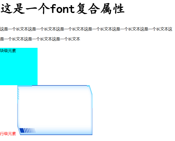
行内元素无法添加高度和宽度,只有块级别可以自定义:
1
2
3
4
5
6
7
8
9
10
11
12
13
14
15
16
17
18
19
20
21
22
23
24
25
26
27
28
29
30
31
| <!DOCTYPE html>
<html lang="en">
<head>
<meta charset="UTF-8">
<meta name="viewport" content="width=device-width, initial-scale=1.0">
<title>CSS常用属性</title>
<style>
.block{
background-color: aqua;
width: 150px;
height: 150px;
}
.inline{
color: red;
}
.inline-block{
width: 300px;
height: 200px;
}
</style>
</head>
<body>
<h1 style="font: bolder 50px 'KaiTi';">这是一个font复合属性</h1>
<p style="line-height: 40px;">这是一个长文本这是一个长文本这是一个长文本这是一个长文本这是一个长文本这是一个长文本这是一个长文本这是一个长文本这是一个长文本</p>
<div class="block">块级元素</div>
<span class="inline">行级元素</span>
<img src="./border.png" alt="" class="inline-block">
</body>
</html>
|
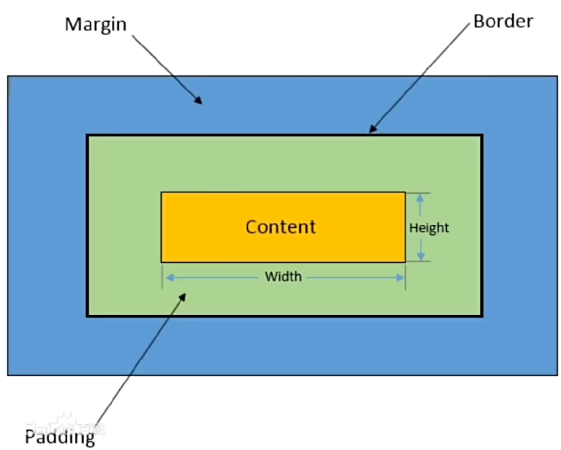
1.4 盒子模型
盒子模型是CSS中常用于布局的基本概念,描述了文档中每个元素都可以被看作一个矩形的盒子,这个盒子包含了内容content,高度height,宽度width,内边距padding,文本边框border,外边距margin,如下图所示
| 属性名 |
说明 |
| 内容(Content) |
盒子包含的实际内容,比如文本、图片等 |
| 内边距(Padding) |
围绕在内容的内部,是内容与边框之间的空间。可以使用padding属性来设置。 |
| 边框(Border) |
围绕在内边距的夕部,是盒子的边界。可以使用`border、属性来设置。 |
| 外边距(Margin) |
围绕在边框的外部,是盒子与其他元素之间的空间,可以使用margin属性来设置 |
1
2
3
4
5
6
7
8
9
10
11
12
13
14
15
16
17
18
19
20
21
22
23
24
25
26
27
28
29
| <!DOCTYPE html>
<html lang="en">
<head>
<meta charset="UTF-8">
<meta name="viewport" content="width=device-width, initial-scale=1.0">
<title>CSS盒子模型</title>
<style>
.border-demo{
background-color: rgb(166, 222, 53);
width: 300px;
height: 200px;
border-style: solid;
border-width: 10px 5px 20px;
border-color: blueviolet;
}
.demo{
background-color: aqua;
display: inline-block;
border:5px solid rgb(11, 11, 11);
padding: 50px;
margin: 40px;
}
</style>
</head>
<body>
<div class="demo">这是一个demo</div> <br><br>
<div class="border-demo">这是边框demo</div>
</body>
</html>
|
我们可以修改盒子模型,来改变元素在页面中的位置和大小
1.5 浮动
在学习浮动之前,先了解传统的网页布局方式。
网页布局方式有以下五种:
- 标准流(普通流、文档流):网页按照元素的书写顺序依次排列
- 浮动
- 定位
- Flexbox
和Grid(自适应布局)
标准流是由块级元素和行内元素按照默认规的方式来排列,块级就是占一行,行内元素一行放好多个元素。
浮动:元素脱离文档流,根据开发者的意愿漂浮到网的任意方向。
浮动属性用于创建浮动框,将其移动到一边,直到左边缘或右边缘触及包含块或另一个浮动框的边缘,这样即可使得元素进行浮动。
语法:
1
2
3
| 选择器{
float: left/right/none
}
|
注意:浮动是相对于父元素浮动,只会在父元素的内部移动
浮动的三大特性:
- 脱标:脱离标准流。
- 一行显示,顶部对齐
- 具备行内块元素特性
1
2
3
4
5
6
7
8
9
10
11
12
13
14
15
16
17
18
19
20
21
22
23
24
25
26
27
28
29
30
31
32
33
34
35
36
37
| <!DOCTYPE html>
<html lang="en">
<head>
<meta charset="UTF-8">
<meta name="viewport" content="width=device-width, initial-scale=1.0">
<title>CSS浮动</title>
<style>
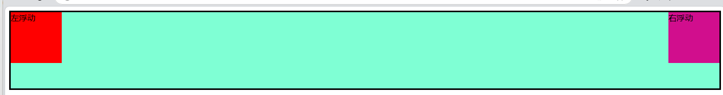
.father{
background-color: aquamarine;
height: 150px;
border: 3px solid black;
}
.left-son{
width:100px;
height: 100px;
background-color: red;
float: left;
}
.right-son{
width:100px;
height: 100px;
background-color: rgb(209, 14, 141);
float:right;
}
</style>
</head>
<body>
<div class="father">
<div class="left-son">左浮动</div>
<div class="right-son">右浮动</div>
</div>
</body>
</html>
|
如果父元素坍塌,我们可以在父元素构造器中加overflow: hidden;来清除坍塌。
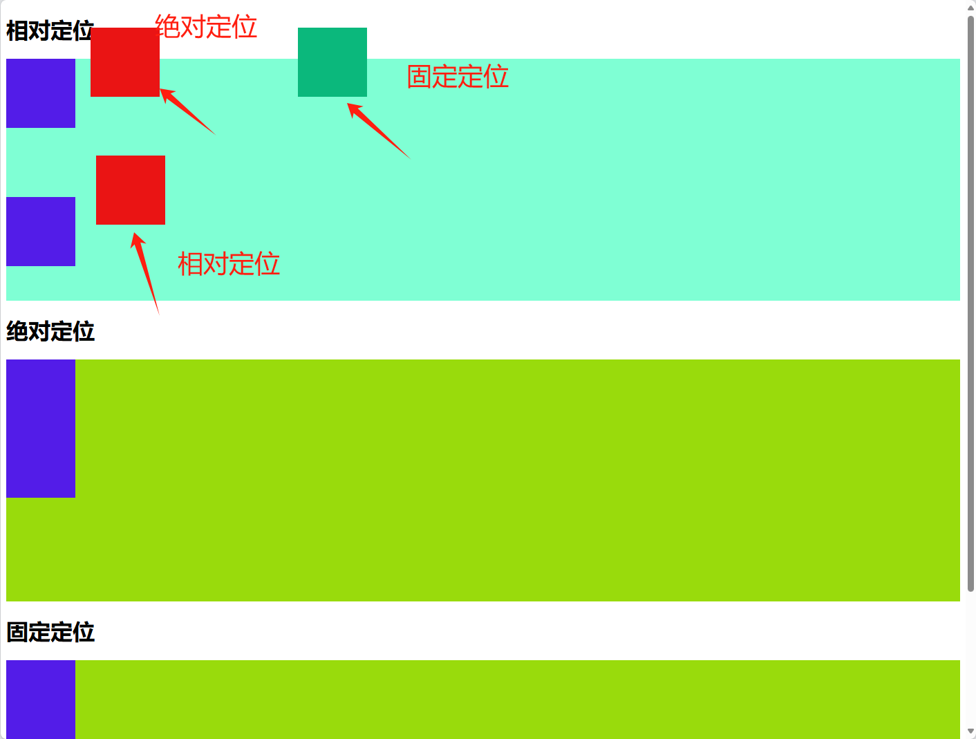
1.6 定位
定位布局可以精准定位,但缺乏灵活性
定位方式:
- 相对定位:相对于元素在文档流中的正常位置进行定位。
- 绝对定位:相对于其最近的已定位祖先元素进行定位,不占据文档流。
- 固定定位:相对于浏览器窗口进行定位。不占据文档流,固定在屏幕上的位置,不随滚动而移动。
1
2
3
4
5
6
7
8
9
10
11
12
13
14
15
16
17
18
19
20
21
22
23
24
25
26
27
28
29
30
31
32
33
34
35
36
37
38
39
40
41
42
43
44
45
46
47
48
49
50
51
52
53
54
55
56
57
58
59
60
61
62
63
64
65
66
67
68
69
70
71
| <!DOCTYPE html>
<html lang="en">
<head>
<meta charset="UTF-8">
<meta name="viewport" content="width=device-width, initial-scale=1.0">
<title>CSS定位</title>
<style>
.box1{
height: 350px;
background-color: aquamarine;
}
.box-normal{
height: 100px;
width: 100px;
background-color: rgb(83, 28, 232);
}
.box-relative{
height: 100px;
width: 100px;
background-color: rgb(234, 20, 20);
position: relative;
left: 130px;
top: 40px;
}
.box2{
height: 350px;
background-color: rgb(153, 219, 12);
}
.box-absolute{
height: 100px;
width: 100px;
background-color: rgb(234, 20, 20);
position: absolute;
left: 130px;
top: 40px;
}
.box3{
height: 350px;
background-color: rgb(153, 219, 12);
}
.box-fixed{
height: 100px;
width: 100px;
background-color: rgb(11, 184, 124);
position: fixed;
left: 430px;
top: 40px;
}
</style>
</head>
<body>
<h1>相对定位</h1>
<div class="box1">
<div class="box-normal"></div>
<div class="box-relative"></div>
<div class="box-normal"></div>
</div>
<h1>绝对定位</h1>
<div class="box2">
<div class="box-normal"></div>
<div class="box-absolute"></div>
<div class="box-normal"></div>
</div>
<h1>固定定位</h1>
<div class="box3">
<div class="box-normal"></div>
<div class="box-fixed"></div>
<div class="box-normal"></div>
</div>
</body>
</html>
|